Pumpkin Choir
 Sometimes I let go of my serious side and just play with eggs and dyes and wax. This is one of those times! Happy Halloween all.
I Hate Orange
I don’t know why, but I hate the color orange. Intellectually I know a world without orange would be boring, but given a choice,  I’ll pick any other color over orange. Even as a kid, I remember my orange crayon would remain in the box, tall and pointed, while the blue crayon wore down to a nub quickly. I don’t wear orange clothing, there is no orange inside my house and when I see orange in Fall decorations, I grit my teeth and try to remember that Christmas reds and greens will replace it soon enough.
This aversion creeps up more often than you’d think. A few years ago my husband, Dave, and I were choosing plants for our new back yard. When the landscape designer asked about our color preferences Dave responded “lots of color, all kinds,” while I said, “anything except orange.” Being the old married couple we are, we came to a compromise—bright orange goldfish in the pond but no orange flowers in the yard.
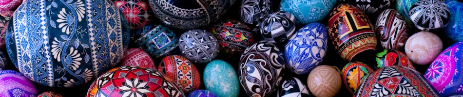
As a result of this dislike I tend to avoid orange in my art, a fact I did not realize until recently while going through some of my egg photos. When I compared color choices and looked at a wide variety of examples from other pysanky artists I saw what a difference it can make. I’ll even admit that orange can add welcome contrast and depth at times.
I still don’t like orange but if I want to grow as an artist I have to stretch beyond myself and experiment with new things, even the color orange. So I’ll try…if I have to…I guess.

